KIS Ticket
Enterprise SAAS Ticketing App for iOS, Android, and Web
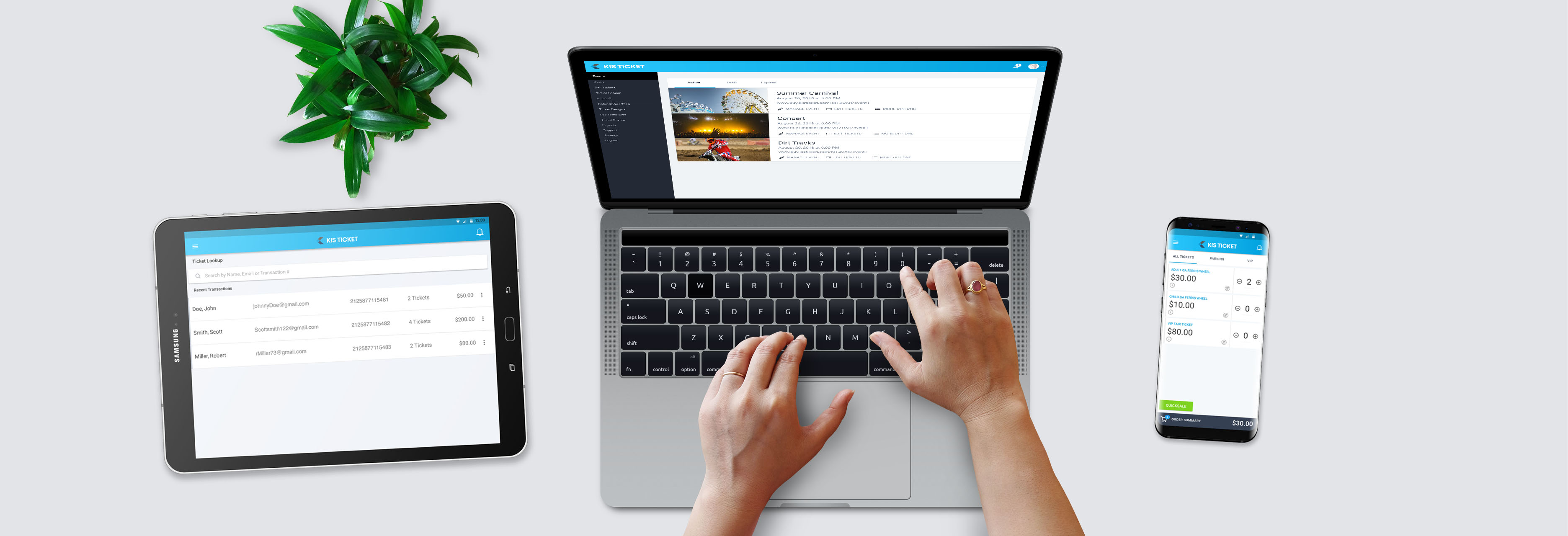
Enterprise SAAS Ticketing App for iOS, Android, and Web
KIS Ticket is an Android and web-based enterprise SAAS app for general admission ticket selling and events.
Learn More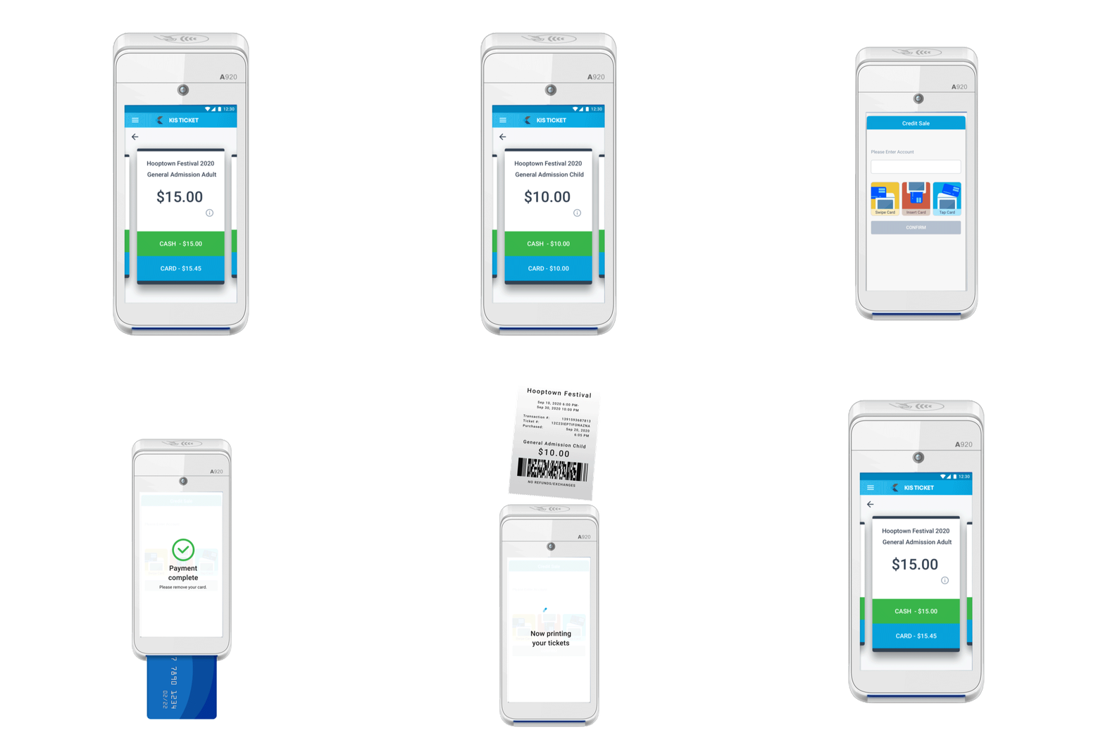
How might we create a robust, flexible point-of-sale and online ticketing platform while “keeping it simple”?
I led the UI/UX Design and Product Management of KIS Ticket from 2015 to the present. I was originally hired to prototype the application and was later hired on full-time and promoted to Senior Product Manager and UI/UX Designer.

Created wireframes, user-flows, and prototypes to accomplish user needs.

Created pixel-perfect mockups and design libraries in Sketch for handoff to developers.

Requirement gathering from key stakeholders, backlog prioritization, and product strategy.

QA and UAT for regular releases plus quantitative and qualitative feedback and bug logging.
Here are some of the programs I used on the KIS Ticket project. As the project evolved, different scenarios called for different tools. We adjusted and refined our workflows, picking the best software suited for each task.







I believe in user-centric iterative design. Here is a breakdown of the process and approach I took on the KIS Ticket project.
I was approached by one of the world’s oldest ticket printing companies, Weldon, Williams & Lick, Inc., to develop a ticketing application for general admission events.
I conducted market research and user interviews to define personas, workflows, and product strategy.
The client and I established goals and defined the scope of the project.
User flows were defined and an interactive prototype was created and shared for feedback from industry professionals.
Once the wireframe was complete, I designed production-ready mockups for handoff to developers.
We released version 1.0 of the product to a pool of Beta users.
We gathered feedback from internal and external testing for feature validation and areas for improvement.
With the advent of modern ticketing applications, the digital ticketing sector has grown rapidly, while the paper ticketing business continues to shrink. In the fall of 2015, I was approached by one of the world’s oldest ticket printing companies, Weldon, Williams & Lick, Inc., to develop a ticketing application for general admission events.
During the first step of my design process, I conducted industry research to understand how competitors and users behaved. This information was crucial for developing user flows and prototyping the product. I started by interviewing industry experts on their basic needs in ticketing, as well as gathering requirements from the key stakeholders at Weldon, Williams & Lick. During my research, I discovered that there were countless sectors in the ticketing industry and almost no standardization among them. To address this issue, I needed to create a system that was flexible and industry-agnostic.
I also reviewed competing products and workflows such as EventBrite, Facebook Events, Ticketfly, and Ticketmaster for inspiration and in order to see what they did well, and what they did poorly. I particularly liked the simplicity and low barrier to entry that Eventbrite and Facebook had with their event-building tools. The flows were very simple and straightforward. Unfortunately their platforms did not offer more robust features that a typical box office was looking for. My goal was to keep the simplicity of a consumer app like Facebook while offering the flexibility of a high-end ticketing system like Ticketmaster.
Once I had acquired some industry knowledge and the client's main objectives, I distilled the requirements into high-level goals. The client wanted to build a mobile app that could replace a series of obsolete ticketing machines they were sunsetting, to meet the demands of a changing market. The machines were branded “KIS Ticket”: an abbreviation “Keep It Simple”. The “Keep It Simple” brand was one of the best qualities of the old product, so we decided to keep it.
Although the original KIS Ticket Machines (pictured below) were reliable, they could not process credit cards, required extensive programming to set up an event and had limited reporting capabilities. They could not sell tickets online and were all around pretty clunky. My goal was to take the best aspects of the old machine (simplicity and reliability) and bolster it with the added benefits of modern-day ticketing platforms.
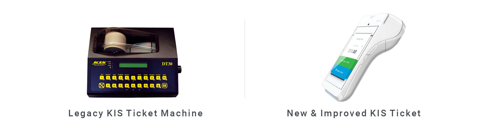
The key features that we wanted to replicate from the old machine included:
We also identified several features to improve upon the old machine, including:
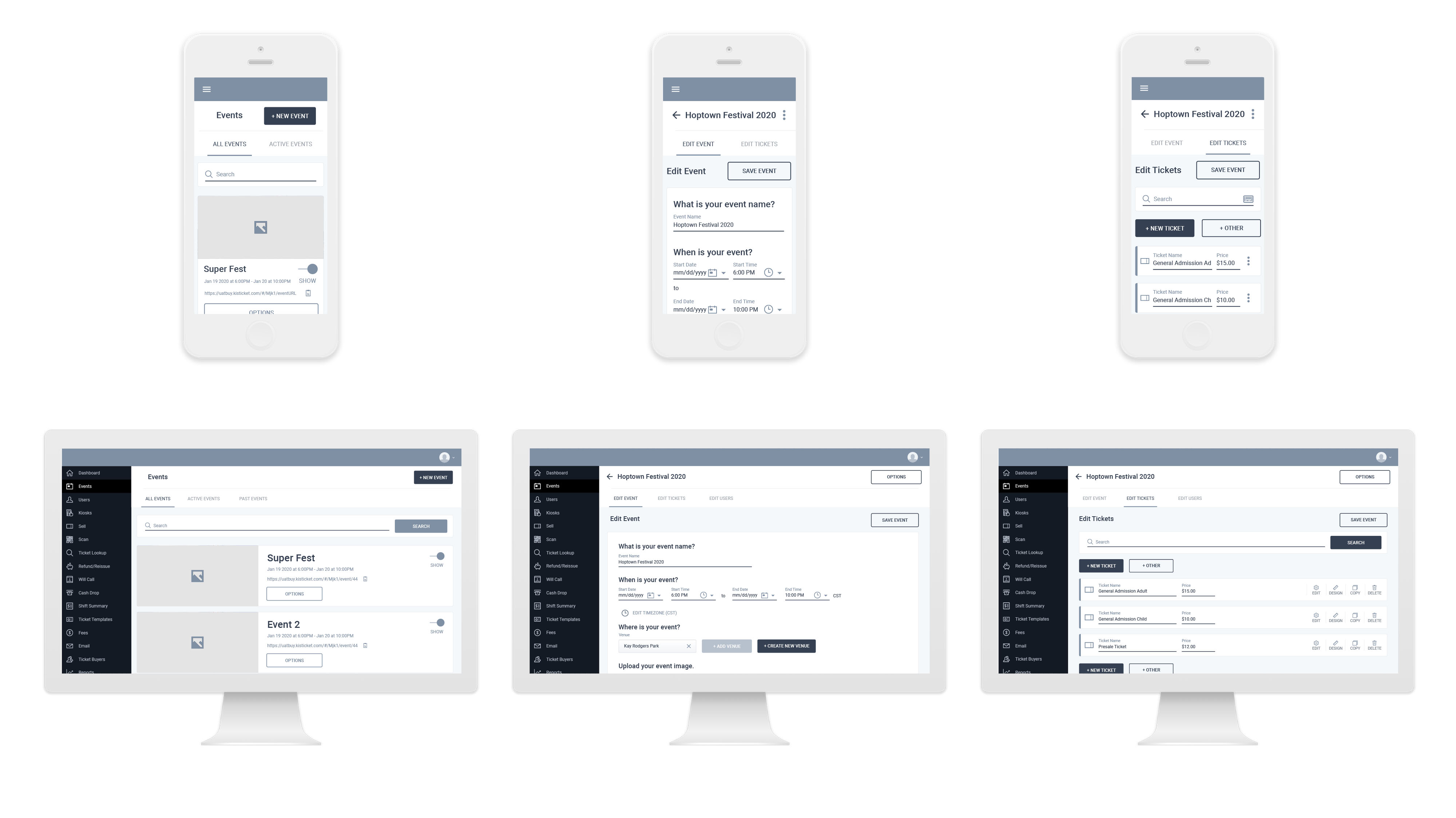
With the above requirements in mind, I began prototyping the event creation flow. My goal was to make the system as simple as possible for the average user, while still offering advanced, industry-specific capabilities when required. A sense of minimalism became an essential element of our “keep it simple” design language. To achieve this, I used dynamic panels in Axure RP to show and hide additional settings as needed.
After completing the initial prototype, I tested it with existing box offices to receive feedback and validation. Our test subjects included Box Office administrators from USC Athletics, the Anaheim Convention Center, and the San Bernardino County Fairgrounds. The response to the prototype was enthusiastic and largely positive. Based on the feedback, however, we discovered that there was a demand for additional features that we had not yet considered: namely promo codes and the ability to use one's own credit card processor. Using this information I was able to refine the prototype and expand it to include these extra features.
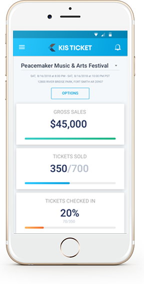
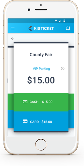
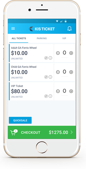
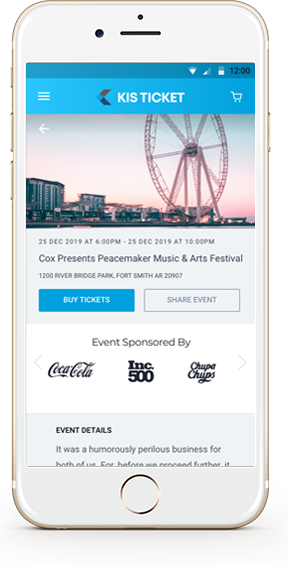
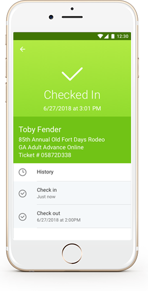
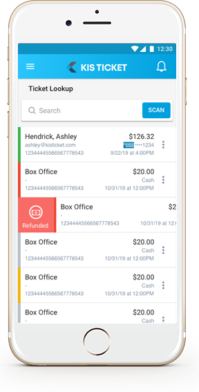
Once the prototype and user flows were complete, I created a design library in line with our “keep it simple” mantra in mind. During the user interviews, I noticed a recurring pattern: our users appreciated the “keep it simple” philosophy. Other ticketing systems that they had used were described as “clunky” and “complex.”
One example of how we simplified ticket selling was our Quicksale feature. With this feature, the user can print and sell tickets with just one press of a button. Not only did Quicksale simplify ticket selling, it also accelerated our average transaction time from 25 seconds to less than 8 seconds (including printing of the ticket and processing the sale). It was primarily this feature that allowed us to land our largest client- tickets for State Fair of Texas’ parking.
My primary tools for User Interface Design included Sketch, Axure RP, and Photoshop. Ultimately, I phased out Photoshop and Axure RP and used Sketch for mock-ups, Invision for prototyping and Zeplin for developer hand-off.
The KIS Ticket project was divided into four modules, each with different roles and personas:
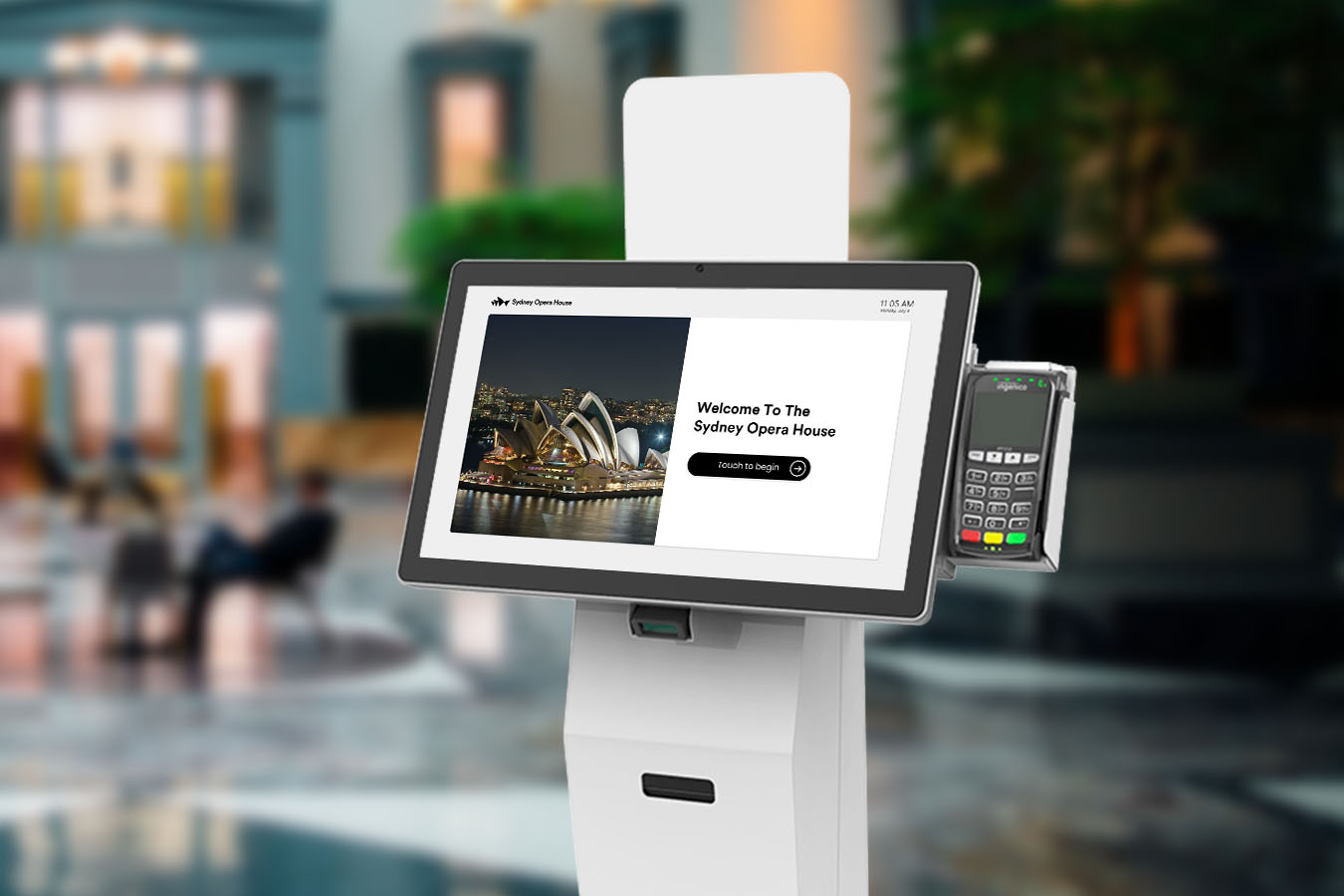
Similar to Apple's suite of products: iPhone, Macbook, Apple TV and Apple Watch, I wanted to create a flexible ticketing ecosystem where tickets could be purchased online, at the point-of-sale, or at a kiosk and used interchangeably.
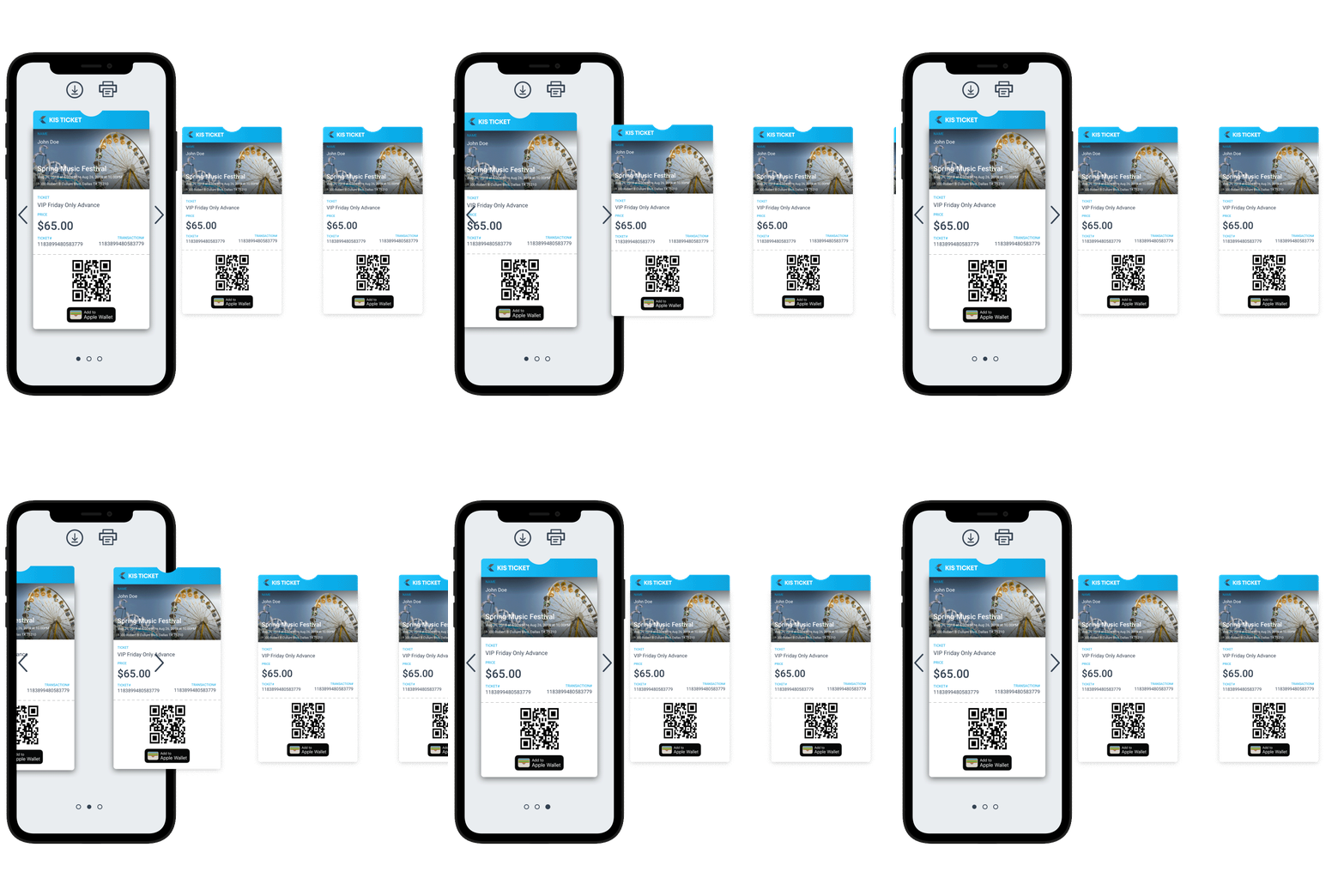
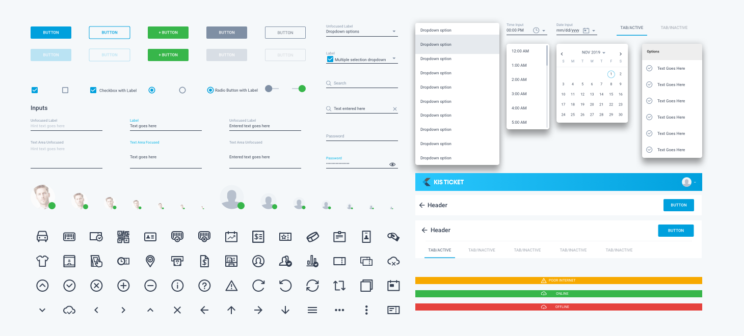
Once I completed our UI Component library, we were able to recycle components across the four modules. I built components that were compatible with web and mobile devices to follow the usability rules of Android and iOS platforms. The reusable components library allowed us to scale and iterate designs quickly, while keeping a consistent look and feel for our users regardless of platform.
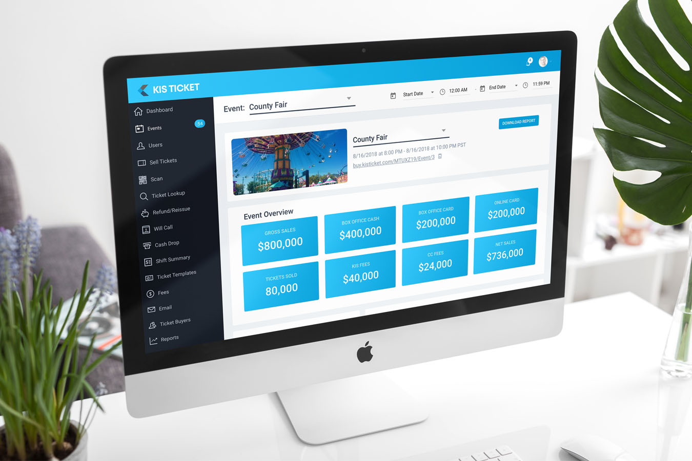
In 2018, the beta version of the product was successfully launched at the Arkansas-Oklahoma State Fair. The main workflows of the system performed beautifully and the clients were impressed by the ease and speed of the system.
However, we discovered that our ancillary processes needed more flushing out. For instance, at times, a ticket buyer would not receive an email with his or her ticket purchase. The operational cost of re-emailing tickets from the database was quickly becoming apparent. Since there was no simple way in our system to re-email tickets, I learned that we needed to design for failure. In addition, some of the reports were not entirely relevant to the needs of our clients.
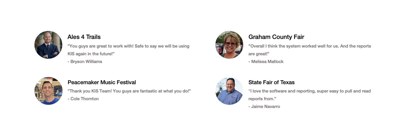
I worked with several of our beta clients to gather feedback on our reporting system, and we eventually released the next version of the product with more advanced reporting and user-flows for negative scenarios. For instance, we added the option to reprint tickets, or re-email tickets in our “Order Lookup” tool. Users quickly embraced the new Order Lookup tools. And the response to our new reporting suite was exceptional. Over 60% of our clients gave overwhelmingly positive feedback on our reporting tools after the new release.
After refining the product from the lessons that we learned during the beta period, we had a phenomenal first year. In 2019, we managed to:

In addition to our product launch, we recently completed an integration with our Kiosk division: KIS Kiosk, adding another member to our ticketing ecosystem.